Small business
Web design
Branding
Front-end development
LodDepot –
Web Redesign
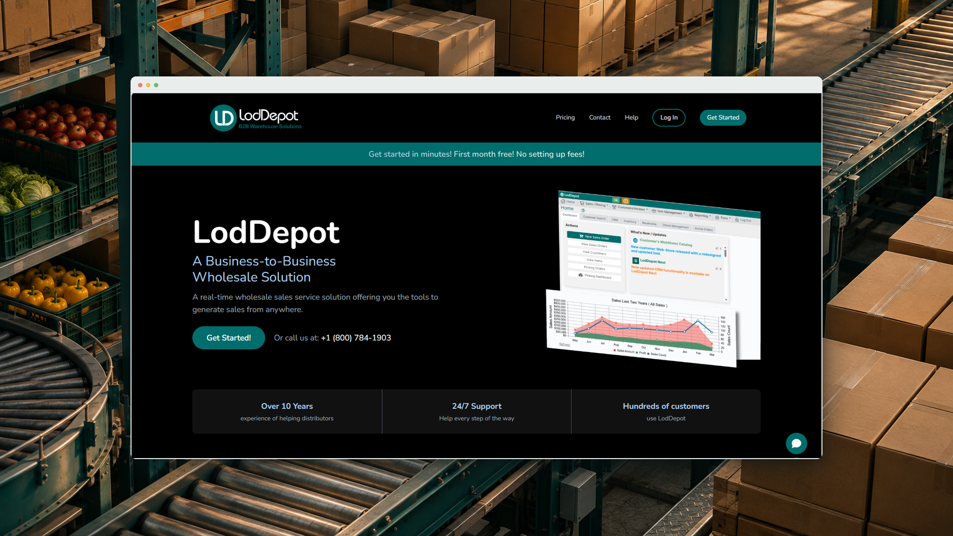
Rebranding and rebuilding a B2B homepage, from research and sketches to a live, accessible site.
Challenge
The brand was barely visible, and the pricing chart hid the most valuable plan.
Solution
I explored two style directions with the client, then designed and built the bolder one.
Impact
A 5% increase in client conversions over the 8 months since the new site went live at loddepot.com.
+5%client conversions over 8 months
4pain points fixed
2style directions explored
What I did
- Competitive research
- UX and content audit
- Low-fidelity sketching
- Wireframing
- Visual design and branding
- Front-end development
- WCAG accessibility
- Client collaboration
01 Research
Bold sites win attention.
- Benchmarked leading platforms like Shopify and QuickBooks to see where LodDepot fits.
- Key insight: the sites that hold attention use bold color and motion.
- Two directions: the client was unsure how far to go, so we planned a modernized Style 1 and a full rebrand Style 2.
02 Audit
A homepage that undersold the product.
ProblemMy fix
"LodDepot" only appeared in a small top-left logoBrand name front and center
Outdated "Connect to Office" info and copyRefreshed, accurate content
Pricing chart buried the customized planCustom plan highlighted as best value
Help Documentation not linked from the homepageHelp docs linked, per the owner's request
Pain points in the original homepage
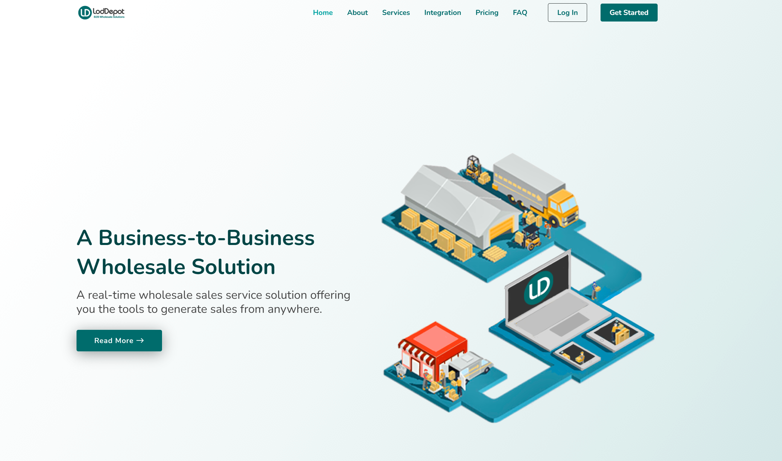
Tip: pick a screenshot to view it here, or click the large one to see it full size.
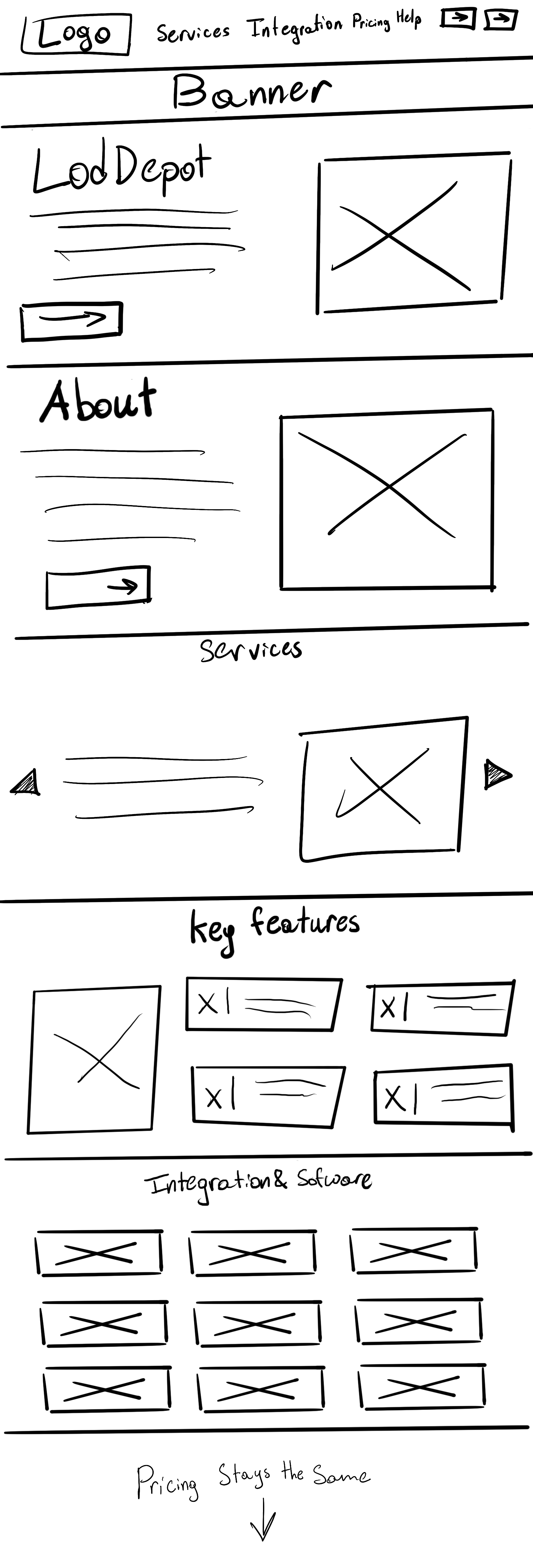
03 Sketch & wireframe
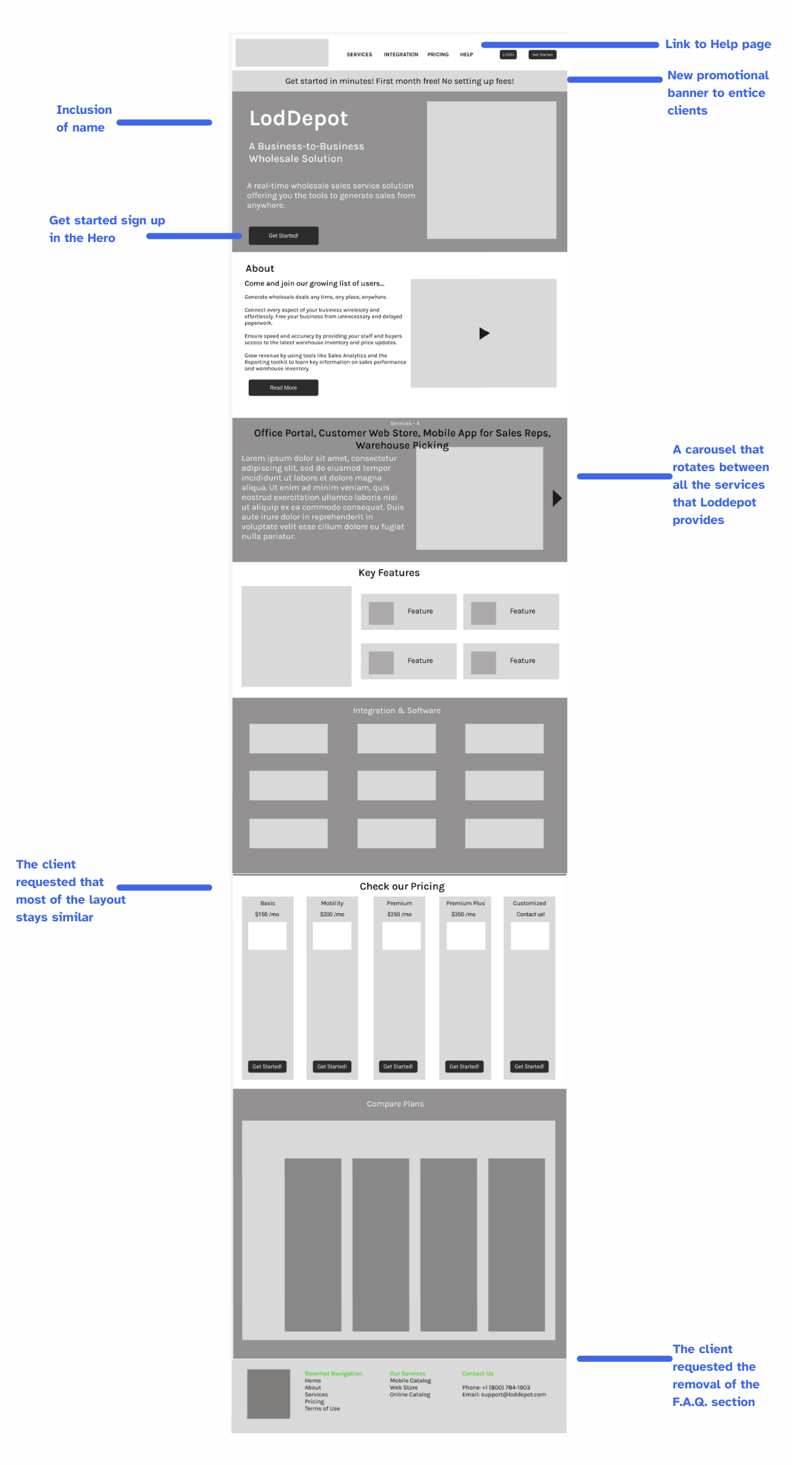
From paper to a flexible Figma wireframe.
- Hand sketches with the client locked in layout and section order early.
- Mid-fidelity wireframe in Figma brought new features into focus and left room to iterate.
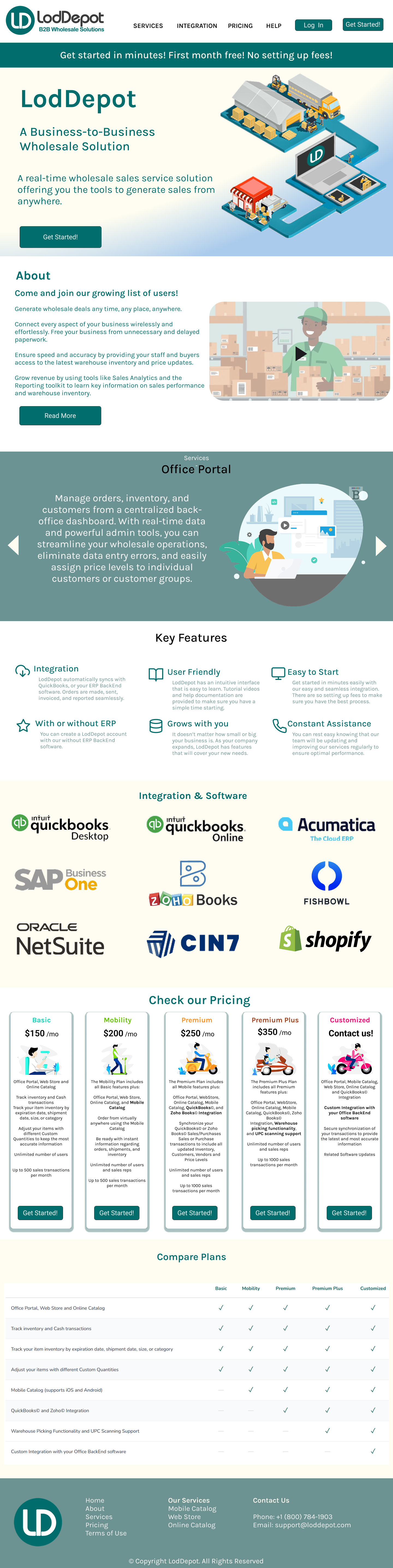
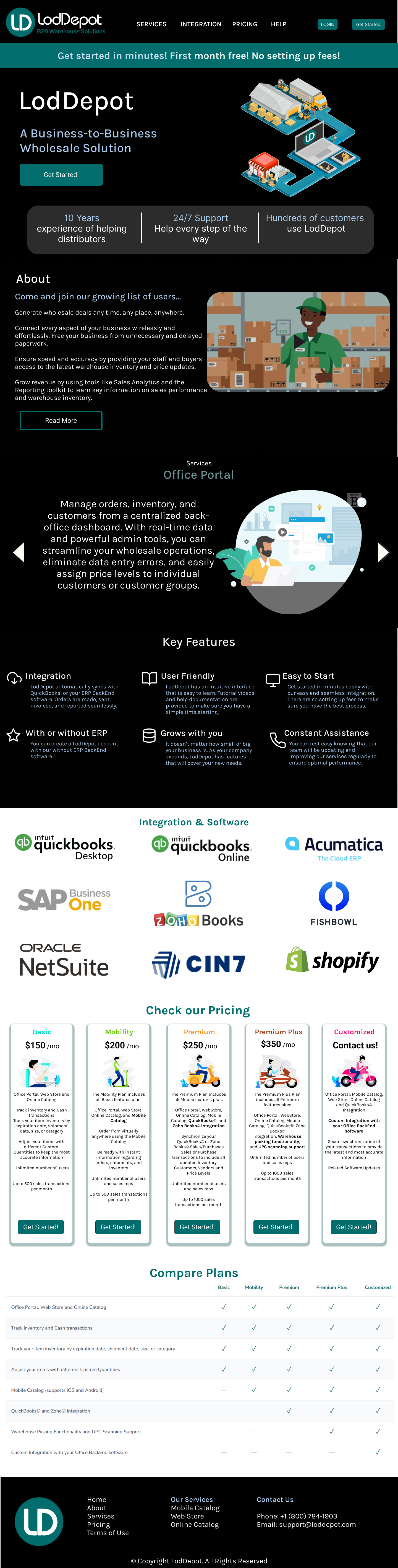
04 Style directions
Two options. The client chose the bold one.
Scroll inside each mockup to see the full page.
05 Build
Designed in Figma, shipped in code.
- Stack: HTML, CSS, JavaScript, Alpine.js and Tailwind CSS, with Claude AI as a development assistant.
- Animated hero that shows off the platform in seconds.
- Varied section colors to break up the dark palette.
- Integrations spotlighted throughout the page.
- WCAG standards followed in every component.
06 Results
A homepage that works as hard as the product.
- 5% increase in client conversions over 8 months since launch
- Live at loddepot.com ↗︎
- Stronger brand presence from the first screen
- Pricing restructured to show the custom plan's value
- Integration features given prominent placement
- Up-to-date content and linked Help Documentation
- WCAG accessibility met across all components