B2B SaaS
Dashboard UX
AI-assisted prototyping
LodDepot –
Internal Ops Dashboard
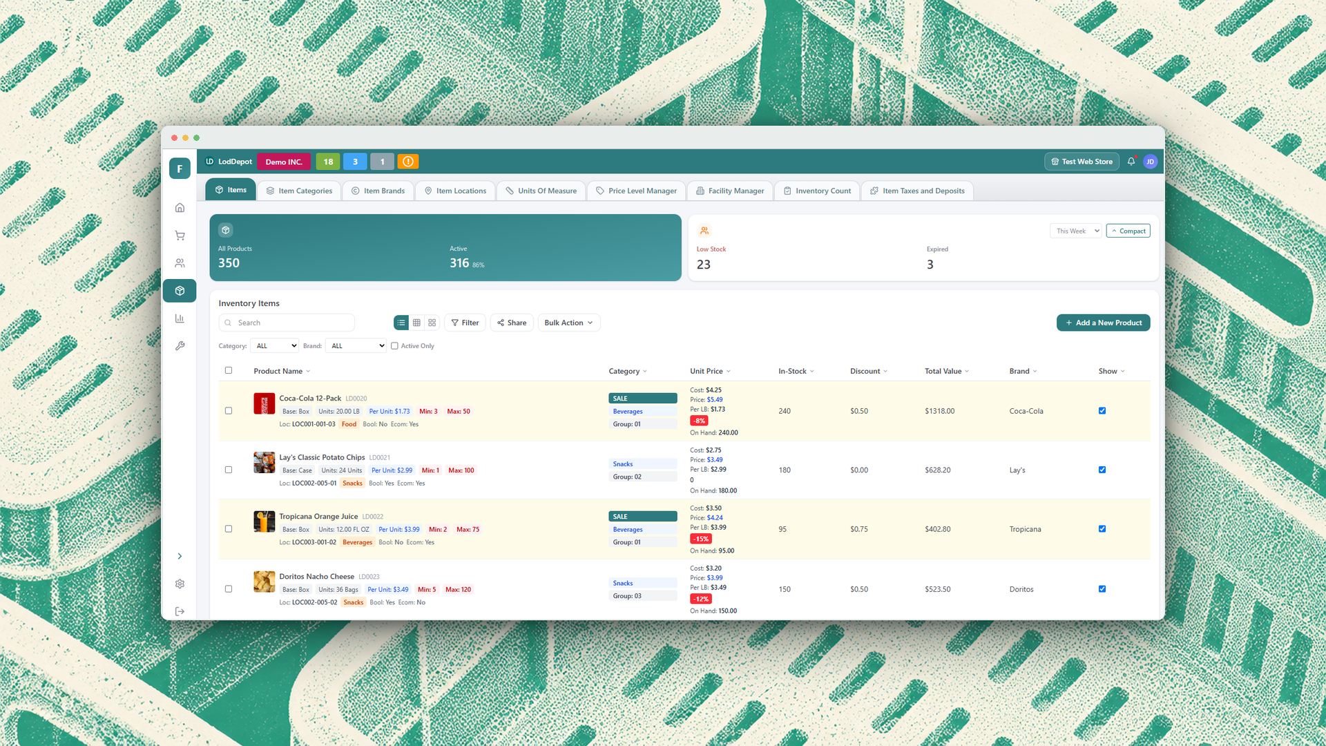
Modernizing a cluttered B2B operations dashboard so teams of every tech level can manage items and pricing faster.
Challenge
Years of added features left the dashboard crowded and dated, with nothing stopping accidental edits.
Solution
A customizable layout with a compact view, plus side menus in place of pop-ups.
Impact
Both redesigns approved by the client and handed off to the development team.
2core tools redesigned
5pain points resolved
2interactive prototypes delivered
What I did
- Client discovery
- Competitive analysis
- UX audit
- Low-fidelity sketching
- High-fidelity prototyping
- AI-assisted design (Figma Make)
- Designing for low tech literacy
- Developer handoff
01 Discover
Know the users. Know the market.
- Client discovery calls: the dashboard looked dated, and years of new features had no clear home.
- Who uses it: many users are older and less tech-savvy, so a total overhaul could not feel foreign.
- Benchmarking: QuickBooks set the bar with a compact layout and an easy sidebar.
02 Audit
Five problems, five fixes.
I reviewed the existing dashboard with the client and mapped every pain point to a design response.
ProblemMy fix
Information overload with no visual hierarchyCompact view and a clear hierarchy
Modal pop-ups interrupt the workflowSliding side menus that keep context
User-entered data is instantly editableSafeguards against accidental edits
Price Level Manager missing new featuresRebuilt with new features and reorganized menus
Out of step with B2B industry standardsModern sidebar and adaptive top nav
Pain points in the original dashboard
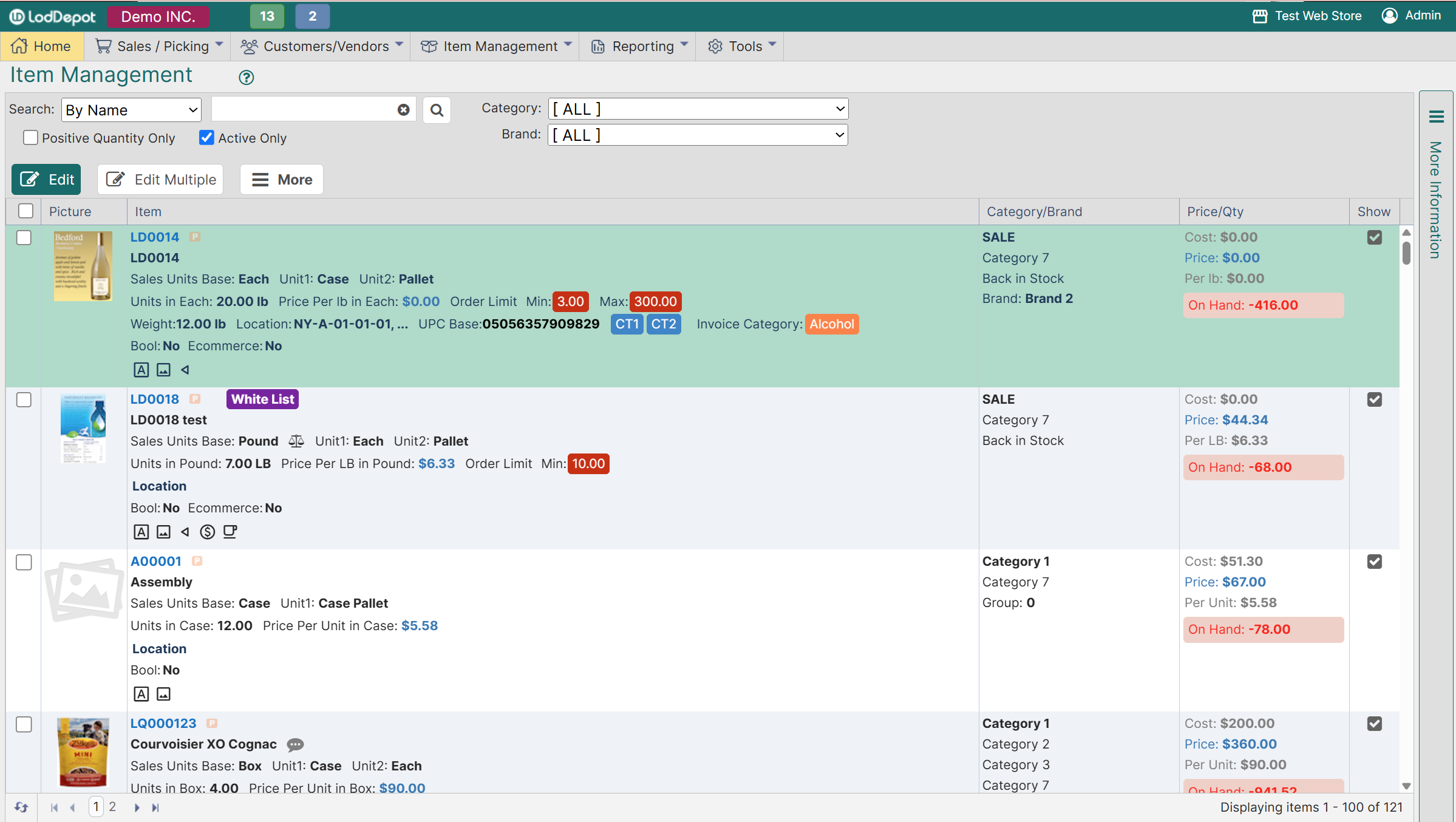
Tip: pick a screenshot to view it here, or click the large one to see it full size.
03 Sketch
Messy first, together with the client.
Hand-drawn low-fidelity sketches let us agree on layout and flow before any pixels were pushed.
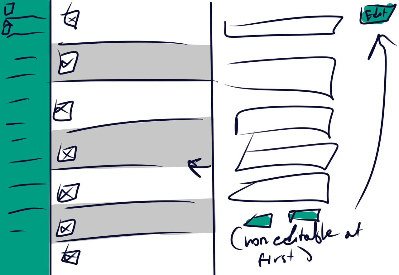
Low-fidelity sketch from a client workshop
04 Prototype
Two tools, rebuilt in Figma and Figma Make.
Item Manager
- Customizable grids: keep a familiar layout or switch to a new one.
- Compact view: key data at a glance with less scrolling.
- Modern shell: an updated look with a sidebar and a top nav that adapts.
Price Level Manager
- Sliding side menus: replace pop-ups so users never lose their place.
- Streamlined flow: move between items and their price levels without losing your place.
- Clarity first: information stays easy to read.
05 Results
Client-approved and headed to development.
- Item Manager and Price Level Manager approved by the client
- Modal pop-ups replaced with sliding side menus
- Safeguards added to protect user-entered data
- Interactive Figma prototypes delivered for developer handoff
- Design aligned with modern B2B SaaS standards
- Familiar options kept for less tech-savvy users