Incluso!
A tech accessibility card game for kids, now played in classrooms across the country and published on EngageCSEdu.
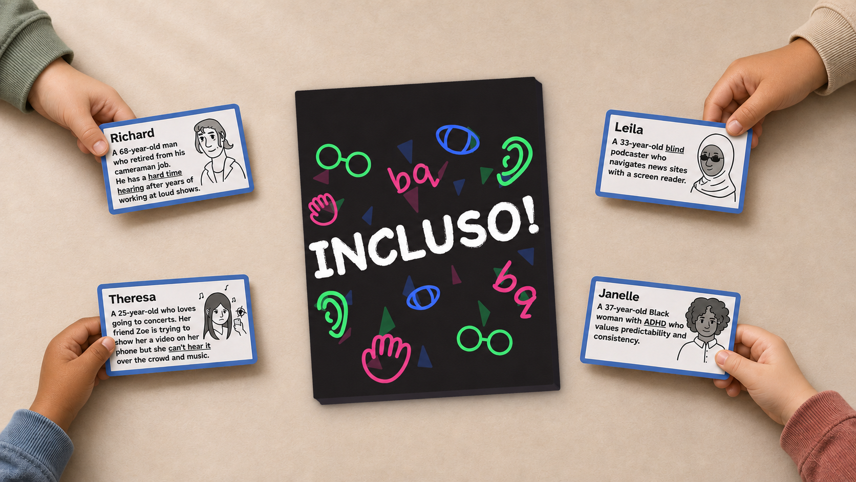
Challenge
Accessibility is taught late, if at all, so developers build bad habits that are hard to undo.
Solution
A card game that teaches K-12 students inclusive design by matching people with the fixes they need.
Impact
Played in classrooms across the country and free to download from the ACM Digital Library.
What I did
- Research collaboration
- Game and rules design
- Paper prototyping
- Playtesting with kids
- Illustration
- Visual and print design
- Inclusive representation
- Academic publication
Teach accessibility early, so it becomes a habit.
If developers learn to build accessibly from the start, there are no bad habits to undo. Incluso! brings that lesson to kids through play.
How it plays
Persona
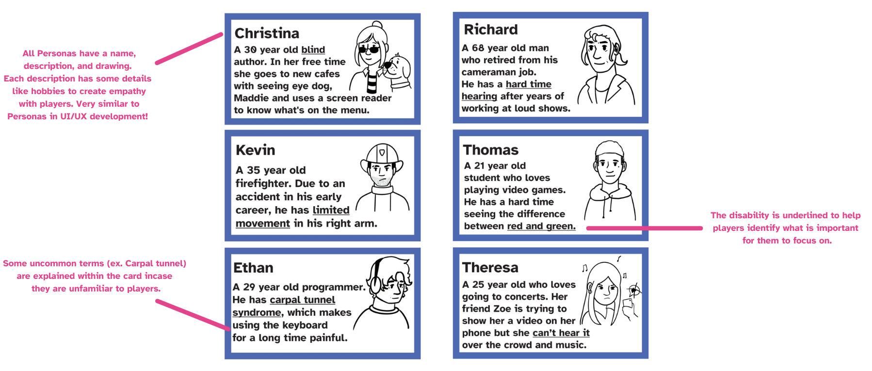
A person with a disability, drawn and named so players connect with them.
Challenge
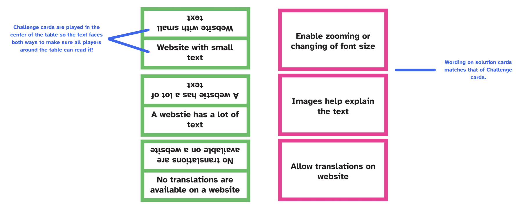
A real problem they might face when using technology.
Solution
A fix developers can build to solve that challenge.
Match all three to make a set. Most sets wins.
Five rule ideas, one winner
We brainstormed and voted on game formats before drawing a single card.
Moderator match
A moderator draws a challenge and players pitch the persona it fits best.
− Needs many flexible persona cards
Slap race
Race to slap down the persona that matches a challenge.
Race + match mashup
A challenge and solution race, then persona matching.
Team sort
Teams race to sort a full deck into complete sets.
Set collector
Collect sets, and steal an unfinished one by adding its third card. Most sets wins.
− Could be too gamey, with less discussion
Sketch fast, then cut what gets in the way.
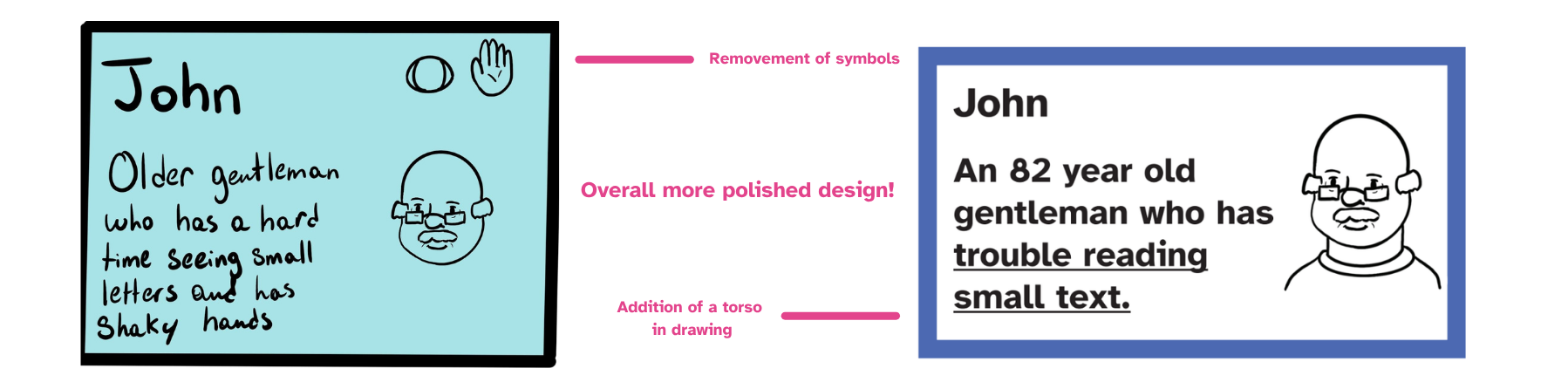
- Drew prototypes in Procreate, giving each persona a name and a story to build empathy.
- Handmade deck of 15 persona sets for the first playtests.
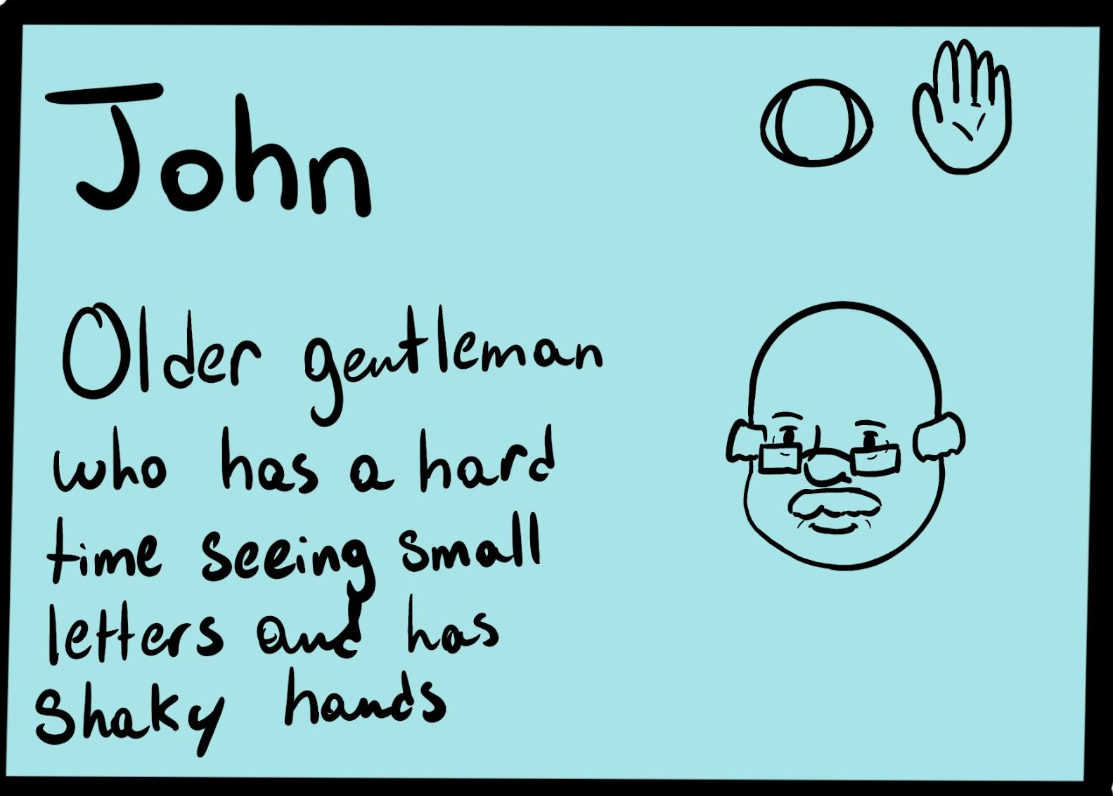
First Persona card prototype
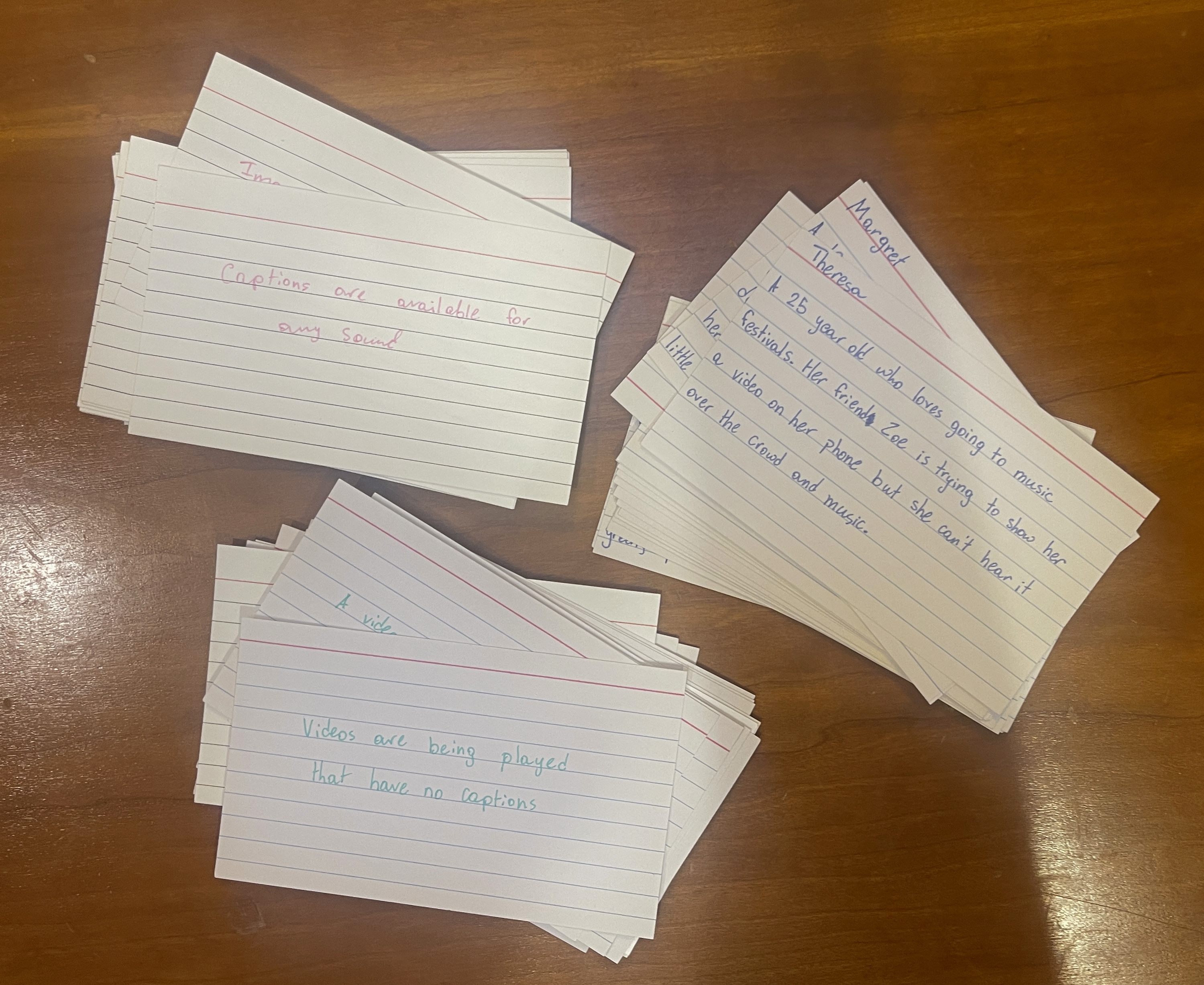
Handwritten deck for the first playtest
A player's idea made the game better.
Five players joined hour-long sessions while I observed. Later rounds with students ages 6–16 refined the wording.
Rules made sense. Some cards didn't.
- A few challenges didn't work or pushed the wrong answer
- A dyslexia set was misplayed
- Too much drawing of cards
- Ideas: more varied challenges, event cards (swap hands, ask for a card)
- Player T's idea: one shared challenge each round that everyone competes for
More fun. Clear fixes.
- Make challenges more specific
- Cap challenges at 5
- Cut the "hands too occupied" challenge
- Bold the disability in each card's text
- 3 players start with 3 cards of each type; 4 to 5 players start with 2
Fun for kids. Easy for teachers.
Final art in Procreate, Illustrator, Photoshop and Acrobat. Every choice had to work for kids and for school printers.
- Accessible font throughout
- The disability is underlined on every persona
- Uncommon terms explained on the card
- Challenge text printed both ways, so everyone at the table can read it
- Solution wording mirrors its challenge
- Colored borders instead of full backgrounds to save ink
- A stylish version and a printer-friendly version
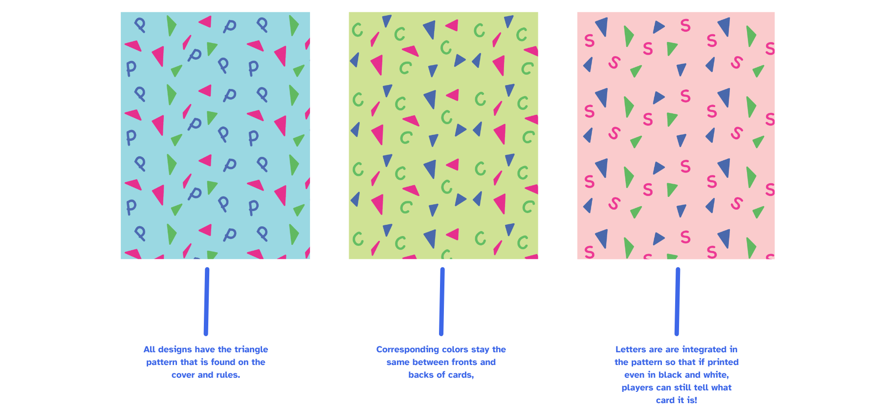
- P, C and S letters built into card backs, so cards work in black and white
- Friendly, cartoony illustrations
- Chalk-style title font that feels playful
- Matching colors on fronts and backs
- A shared triangle pattern ties the whole deck together
The annotated design sheet
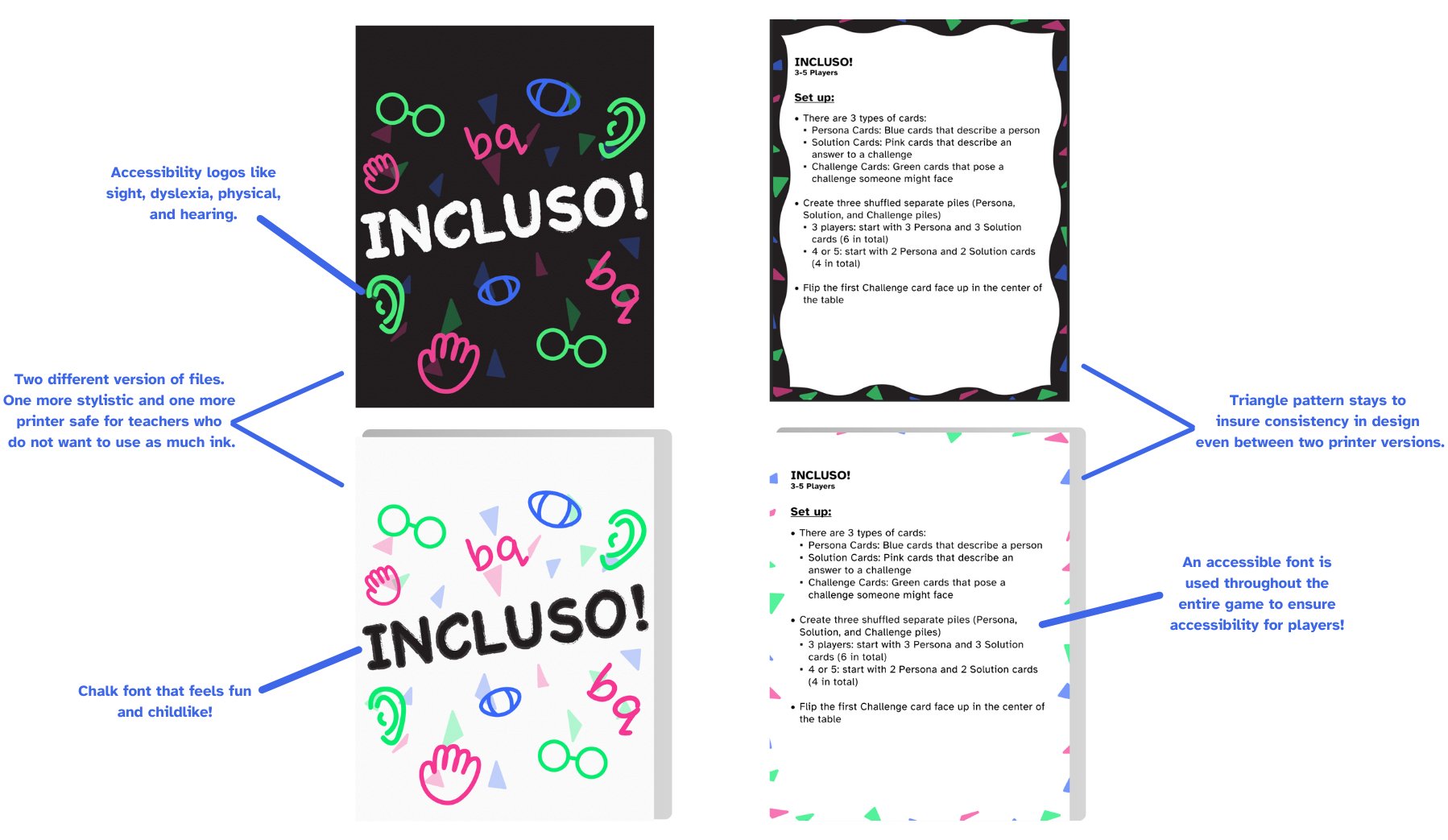
Tip: click any part of the sheet to see it full size.
Expansion pack
- More personas and more types of disability represented.
- Grayscale art keeps hair and skin tone variation visible, even when printed in black and white.
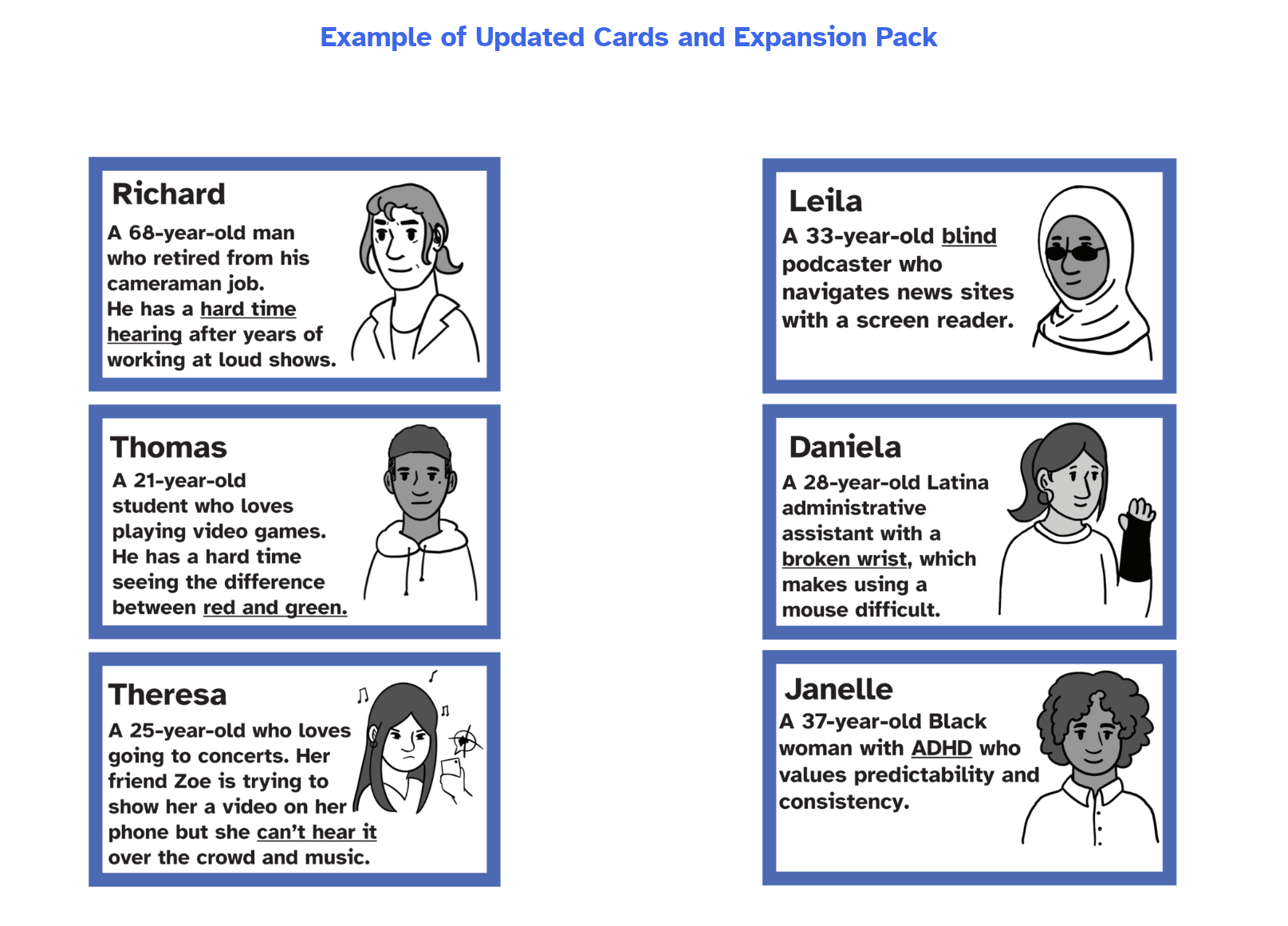
Updated cards and the expansion pack
Now in real classrooms.
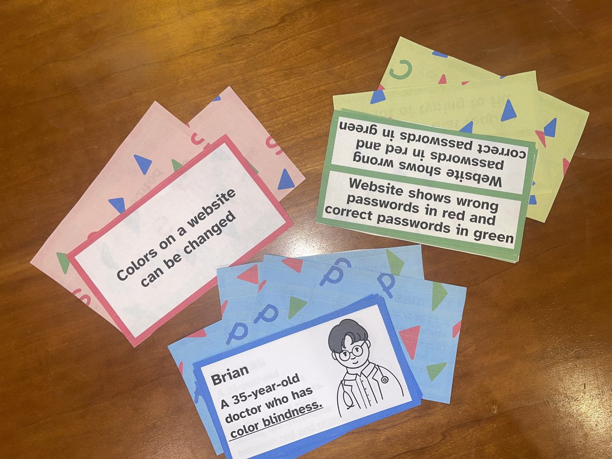
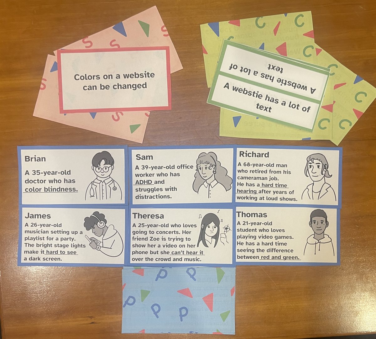
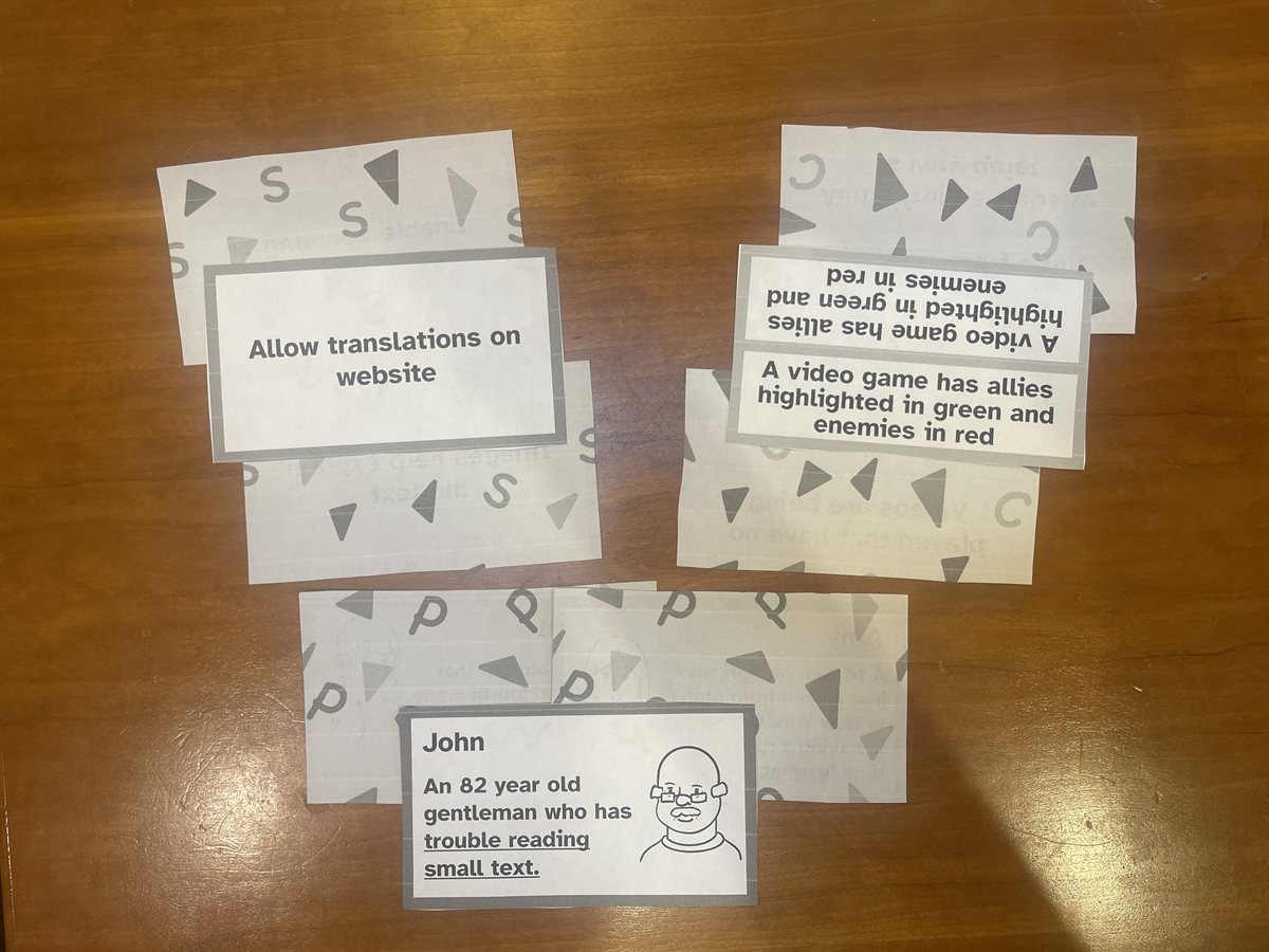
The finished, printed deck
- Played in classrooms across the country
- Published on EngageCSEdu: "Incluso!: Introducing Universal Design Through Play"
- Free to download from the ACM Digital Library ↗︎
- Idea to classroom in a single semester
- Playtested with students ages 6–16
- Expansion pack with more representation and a grayscale option